CME Construction Solutions Logo Design
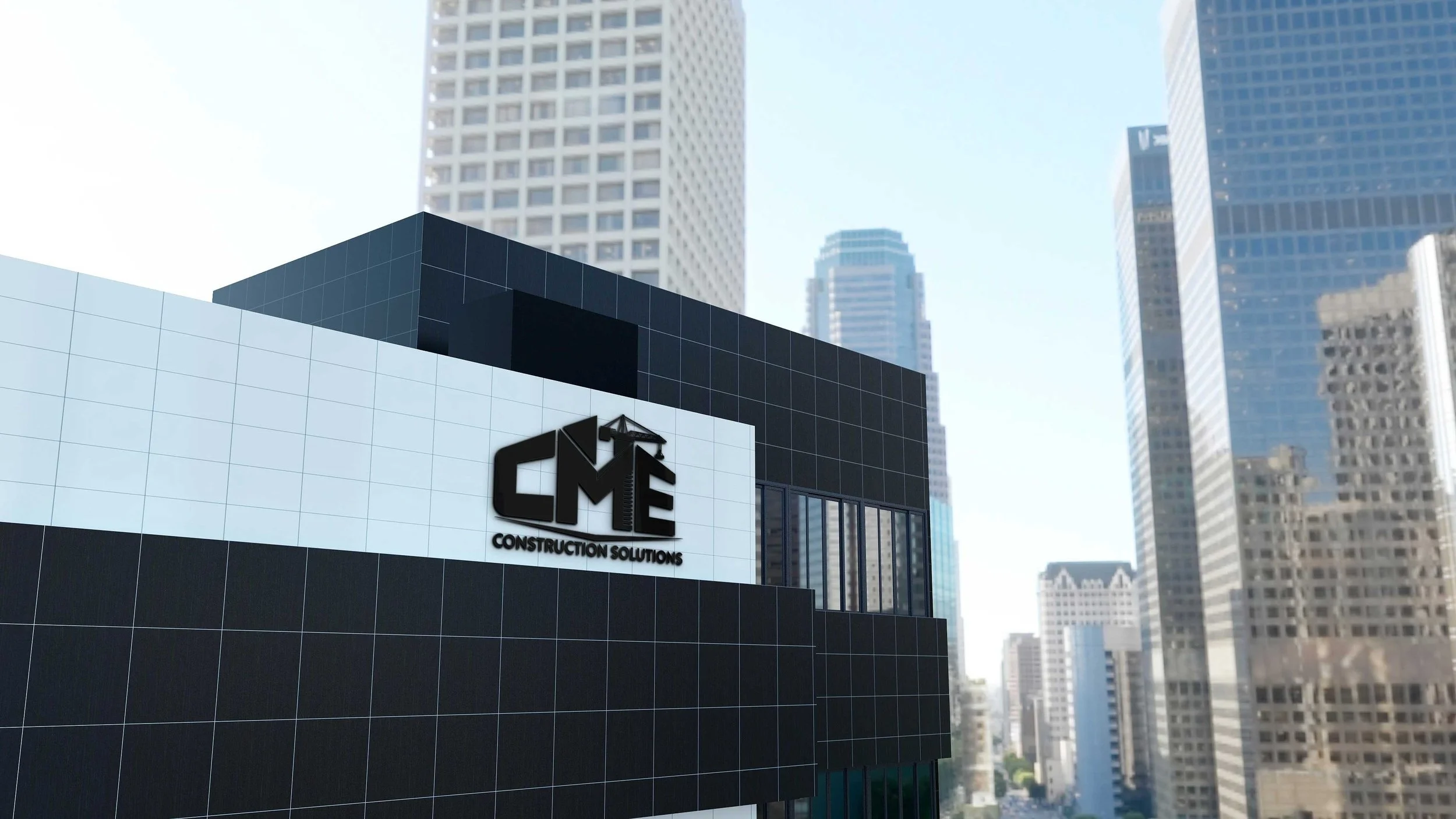
The CME Construction Solutions logo is a bold, structurally inspired mark that reflects strength, precision and reliability within the construction industry. Designed using heavy geometric letterforms, the logo mimics architectural frameworks to create the impression of something that is built rather than written.
The integrated crane element reinforces the company’s hands-on capability, while the triangular peak above the “M” introduces a roofline effect that enhances the building narrative and adds visual balance.
Finished with an industrial concrete texture, the logo communicates durability, professionalism and a strong, masculine presence — aligning seamlessly with CME’s role in delivering solid construction solutions.